We aim to combine TimesPro, Times Professional Learning, TSW, Enterprise Business, ET Cases into one single website so users can browse through all the courses offered by Time Group on one single website
Unified Website
Design System
Improved User Journey
Overview
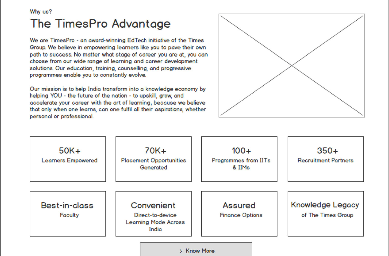
Redesigning the User experience for 10 million customers and improving conversions significantly in the process.
Roles & Responsibilities:
User Research: User Flow, Journey Mapping,
UX Design: Sketches, Wireframing, User Interface, Style Guide
Use Case Definition
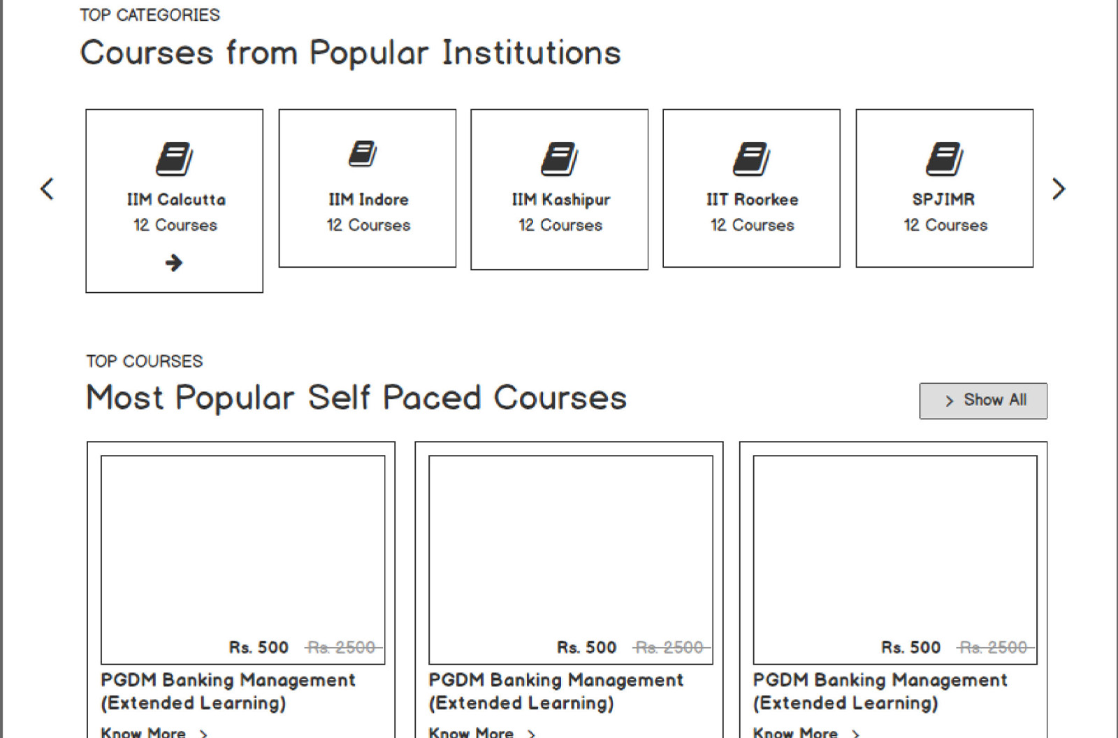
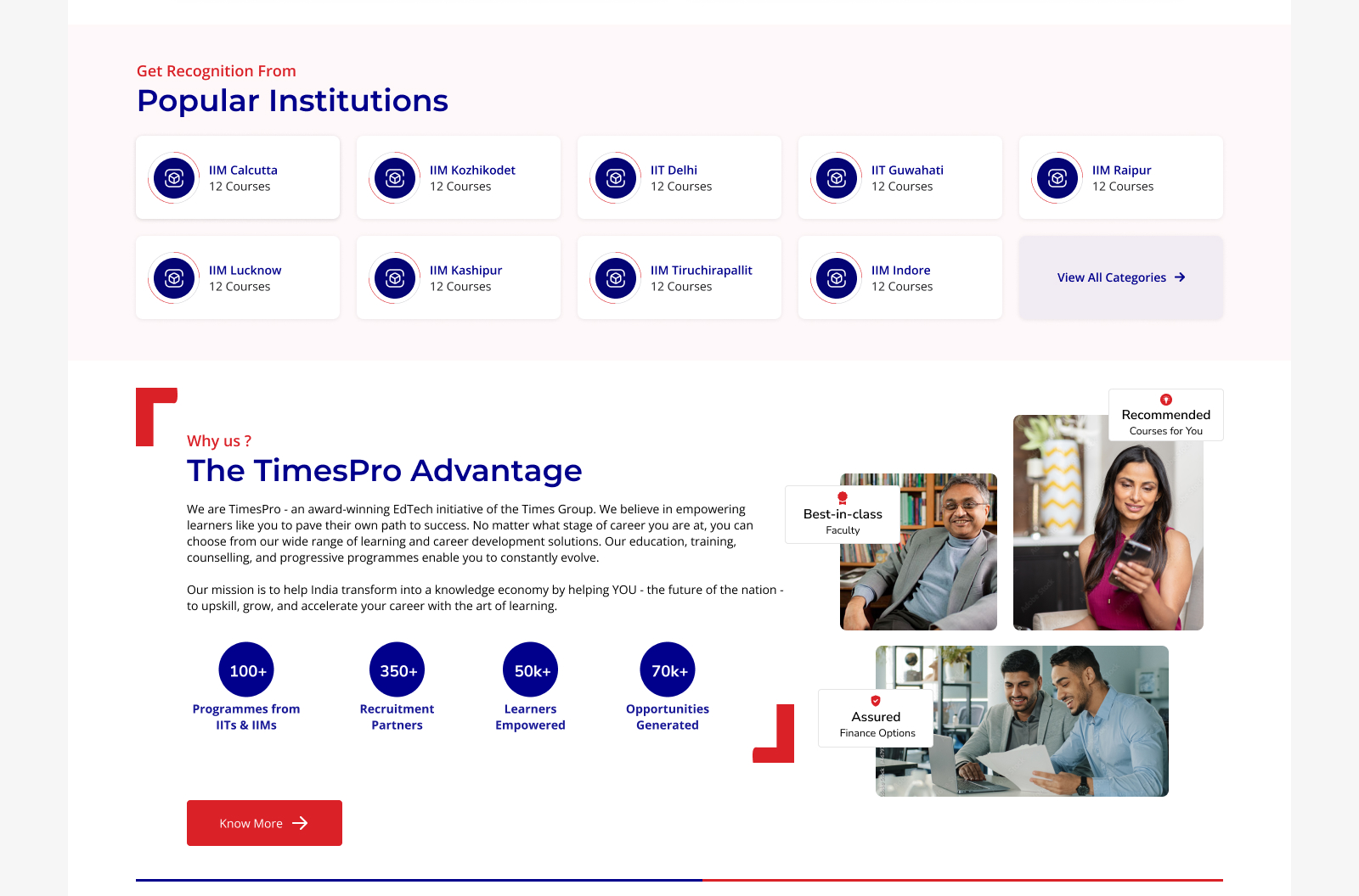
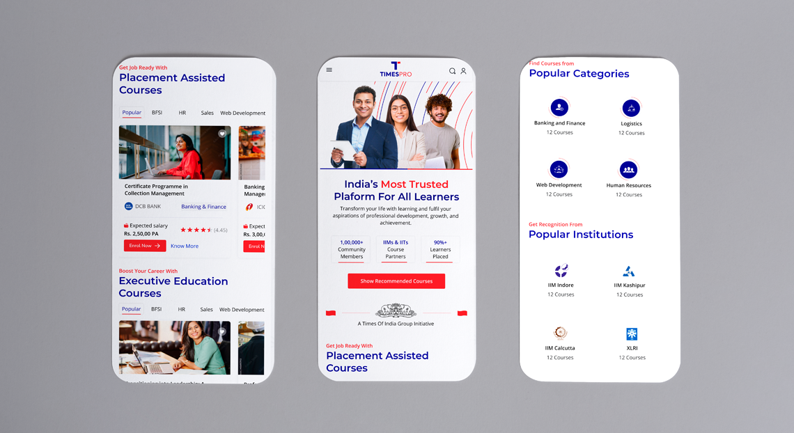
We had separate websites for TimesPro, Times Professional Learning, TSW, Enterprise Business, and ET Cases. Combining all of these websites will provide a better user experience and make it easier to analyze what our users want.
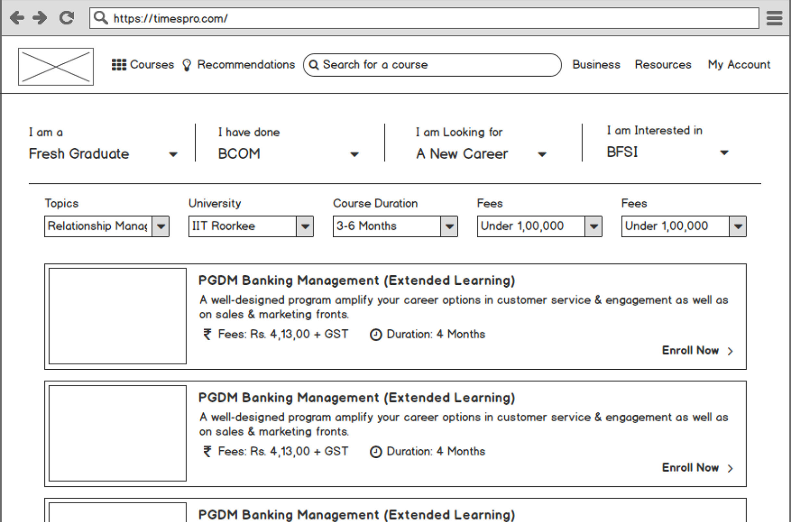
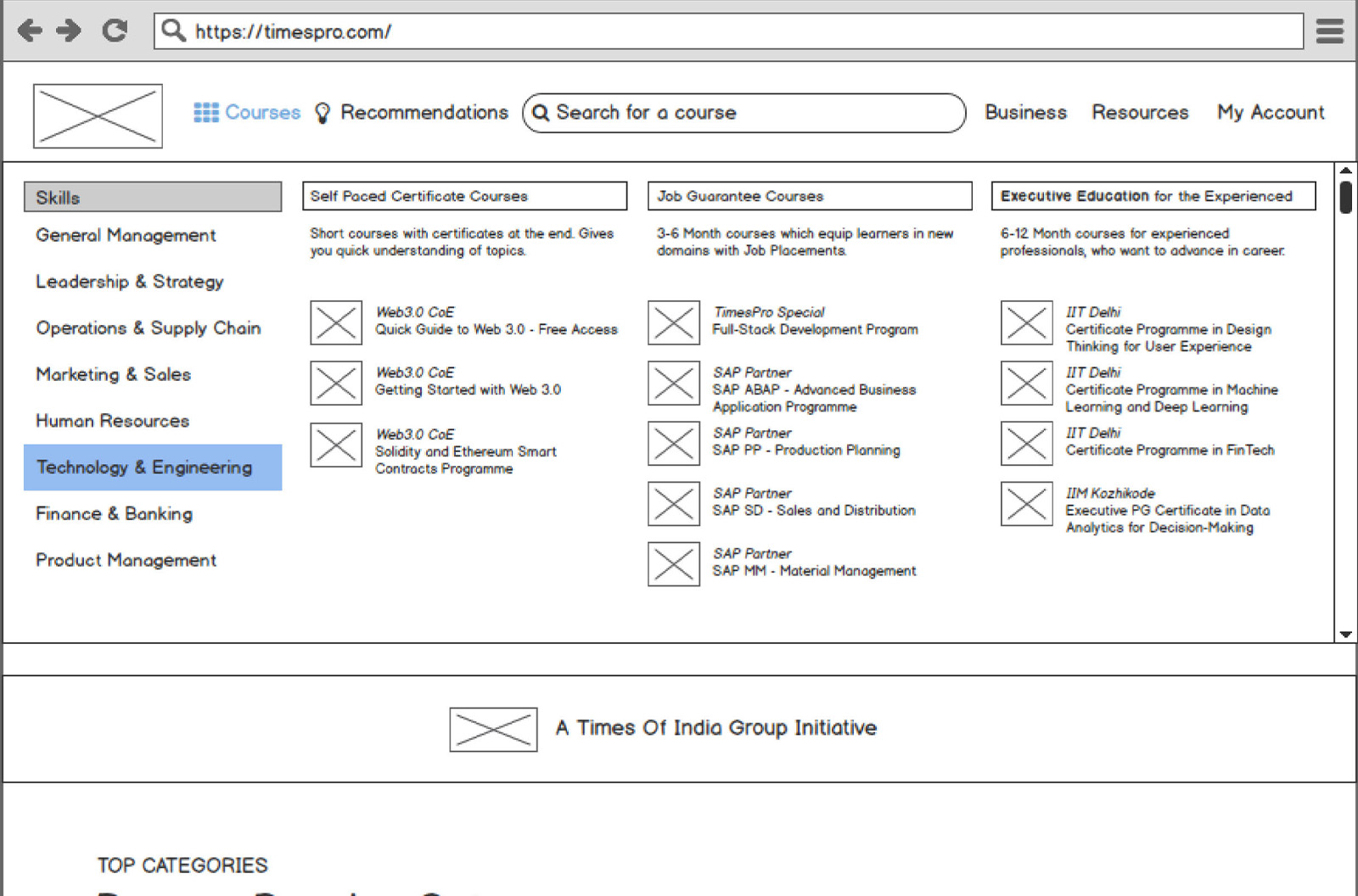
The user experience has to be customized based on the audience personas of each respective business, while also considering general trends. For example, ease of navigation for Early Career, category and partner placement for Enterprise Business, and content placement for B2B/B2C.
My UX process doesn’t end with the launch of the product. I continuously monitor user feedback and behavior to identify areas for improvement and make necessary updates. This iterative approach ensures that our products are user-centered and meet the needs of our users.
Research
The user research phase involved conducting interviews with a variety of users, including students, parents, and teachers. The research revealed that the users had a number of problems with the old website, including:
It was difficult to find the information they needed
The website was not visually appealing.
The website was not mobile-friendly.
Insights
User
Ages between 18 and 35
Average time spends
2 hrs per day
88%
Devices
Smartphone
Location
II Tier Cities and III Tier Cities
Users want a positive and engaging user experience. They want websites that are easy to use and navigate, and that offer features such as interactive content, video lessons, and community forums.
User needs: Users of edtech websites are looking for a variety of things, including:
Flexibility: They want to be able to learn at their own pace and on their own time. Affordability: They are looking for affordable options that won’t break the bank. Quality: They want to make sure that the content they are learning is high quality and will help them achieve their goals.
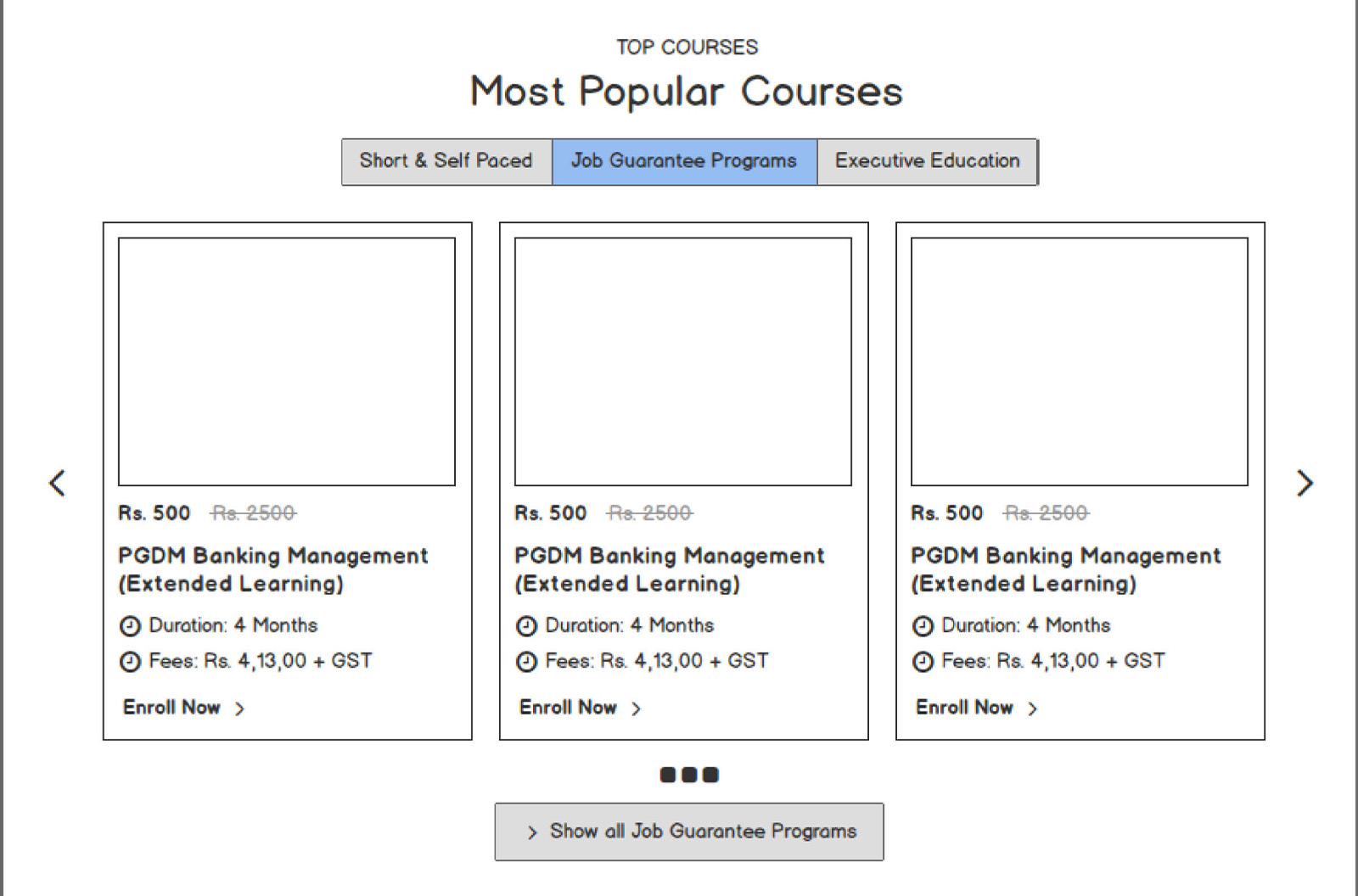
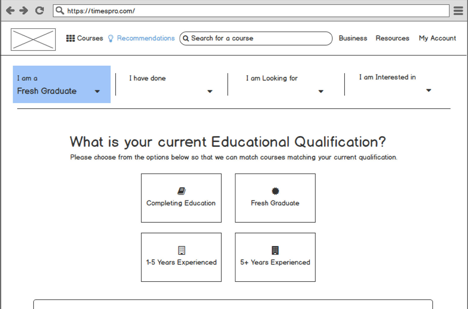
After creating the wireframe, our next step was to define the interaction and user flow. This involves determining how users will navigate through the interface, interact with elements, and accomplish tasks. Interaction design includes creating user flows, defining clickable elements, and incorporating intuitive navigation.
Once we completed the user interface, we developed a clickable prototype. This allowed stakeholders and users to interact with the interface and provided a more realistic representation of the final product. Prototyping helped identify potential usability issues and allowed for iterative improvements.
“Digital design is like painting, except the paint never dries.”